A visitor lands on your site, looks around for a few seconds, and leaves without clicking anything.
Nobody can point to a single reason. The page loaded fine. The product is good. The copy makes sense. But something about the experience made them hesitate, and hesitation on a website almost always ends in a closed tab.
That's not a traffic problem. It's a design problem -- and it's usually invisible until someone actually measures it, because nothing about the site looks obviously broken.
#The Numbers Behind "It's Just Design"
Design gets treated as the polish that happens after the real work is done. The data says otherwise.
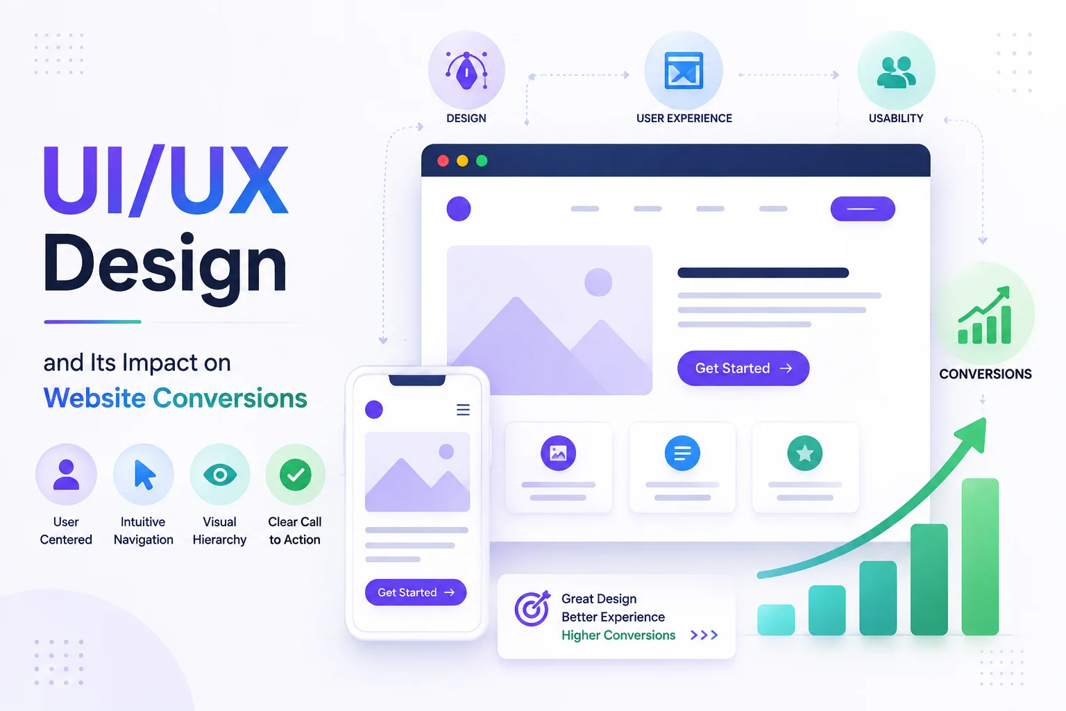
A well-executed UI can lift conversion rates by up to 200%. A strong end-to-end UX can push that as high as 400%, according to Forrester research.
Simplified checkout flows -- three to four steps, not seven -- reduce cart abandonment by roughly 35%, per Baymard Institute's research.
High-contrast CTA buttons generate around 21% more clicks than ones that blend into the page.
None of that is about making things prettier. It's about removing the small moments of friction that quietly talk a visitor out of finishing what they came to do.
#Where Conversions Actually Get Lost
Most sites don't lose conversions in one dramatic failure. They lose them in a string of small ones.
Forms that ask for more than they need. Every extra field is a reason to stop halfway through.
Navigation that makes people think. If a visitor has to guess where to click next, they've already started leaving.
CTAs that don't stand out. A button that blends into the page isn't a call to action -- it's decoration.
Slow load times. Every additional second past three seconds can cost up to 20% in conversion rate.
Mobile experiences that were clearly designed for desktop first. More than half of web traffic is mobile, and mobile conversion rates still lag desktop by a wide margin.
Each one seems minor in isolation. Stacked together across a full user journey, they add up to a site that technically works but quietly loses people at every step.
#Good Design Isn't the Same as Good-Looking Design
This is where a lot of redesigns miss the point. A visually striking site and a converting site aren't automatically the same thing.
A homepage can look modern, use a trendy color palette, and still confuse visitors about what to do next. Good UX design starts with a different question: what is this person trying to accomplish, and what's standing between them and doing it?
That's a research and structure question before it's a visual one. The visuals matter -- but only once the underlying flow actually makes sense.
#What a Real UX Audit Actually Looks For
Skip the instinct to redesign everything at once. A useful audit narrows down to specifics.
Where do visitors actually drop off? Analytics usually shows this clearly -- a specific page, a specific form field, a specific step in checkout.
What's the shortest path to the goal? Every unnecessary click or field is a chance for someone to reconsider.
Does the design work on the device people are actually using? Testing only on desktop when most traffic is mobile misses the real experience entirely.
Is the important action visually obvious? If a visitor has to search for the button that matters, the design has already failed at its one job.
How fast does it load? No amount of polish makes up for a page that takes too long to appear.
#Fixing the Right Things First
The instinct after seeing conversion numbers is usually to rebuild the whole site. That's rarely the right first move.
Start with the highest-traffic page that's underperforming, not the page that's easiest to redesign.
Fix one friction point at a time and measure it -- a full redesign makes it impossible to know which change actually worked.
Test with real users, not internal opinions. Five people using the actual flow reveal more than a team debating in a meeting room.
Treat mobile as the primary experience, not an adjustment made after the desktop version is finished.
Small, measured changes compound. A checkout flow trimmed from six steps to three, or a CTA that finally stands out against the page, often moves the needle more than an entire visual overhaul.
#Where Codegrin Fits In
Codegrin's design team (https://www.codegrin.com/services/ui-ux-creative-design-services) approaches UX the same way -- starting with where visitors are actually getting stuck, not with a blank canvas and a trend board. That means auditing the real user journey first, then designing around the friction that's actually costing conversions.
#Frequently Asked Questions
#The Real Point
A website doesn't need to look impressive to convert well. It needs to remove every unnecessary reason for a visitor to hesitate.
That's the actual job of UI/UX design -- not decoration, but the difference between a visitor who completes what they came to do and one who quietly closes the tab.
Stop guessing where your website is losing conversions. Talk to Codegrin (https://www.codegrin.com/contact) about a UX audit that finds the friction and shows you what to fix.


